Example post
This post shows how various media (mainly images) are styled by default in Zonelots.
Images
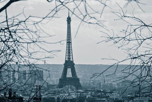
Images scale down if they're wider than the main column, but otherwise keep their original size.

Galleries
Image galleries are sets of images. The images are cropped to be square, and the more images there are, the more columns the gallery has (up to a point). Here's a gallery with one image:

With 2–4 images, there are 2 columns:

With 5–9 images, there are 3 columns:
And with 10+ images, there are 4 columns:
Each gallery is an ordered or unordered list with the class gallery. Each image is wrapped in a list item element. The code looks like this:
<ul class="gallery">
	<li><img src="" alt=""></li>
	<li><img src="" alt=""></li>
	<li><img src="" alt=""></li>
</ul>
The CSS handles the scaling automatically depending on the number of list items.
Zonelots doesn't include a lightbox feature, so galleries are best used in situations where readers don't need to see the image in detail inline in the blog post (they can always download the image or view it in a separate tab if they want the full version).
Iframes
Iframes fit inside the main column, even if they would be wider. For example, this iframe (Drawing Garden) is set to 1000 pixels wide, but the main column is 800 pixels wide including the padding and border, so the iframe is reduced to fit: