
June 2022
Various prototypes working toward a redesign of Mozilla's app for reading articles: Pocket.
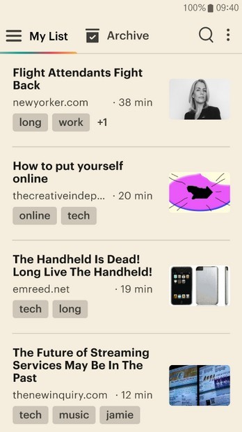
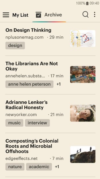
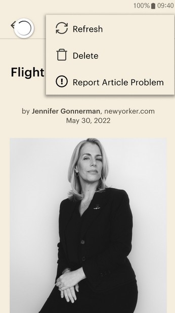
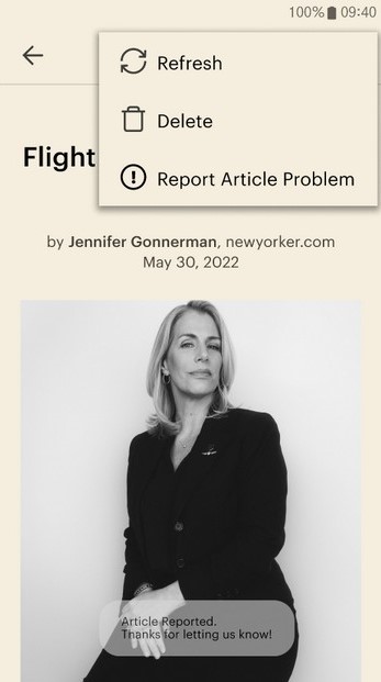
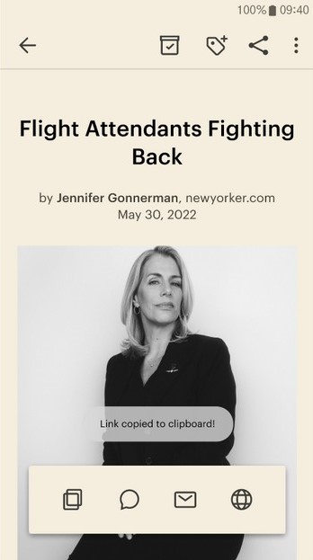
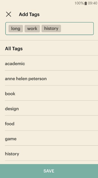
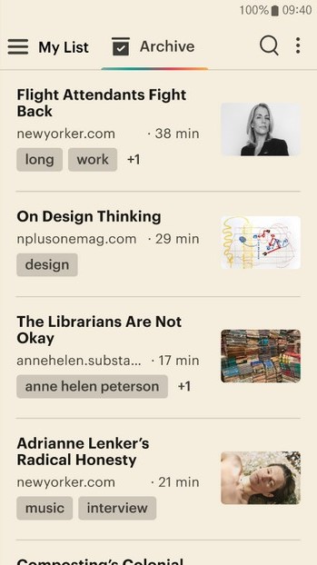
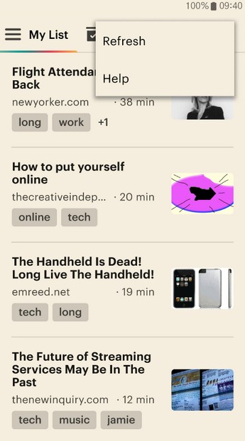
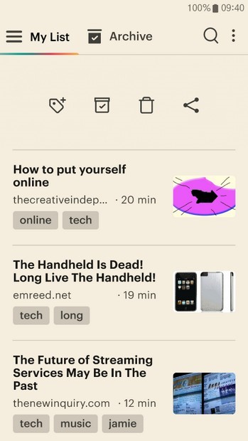
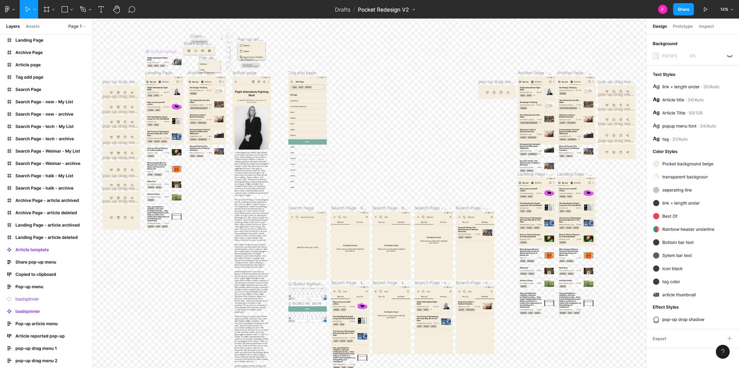
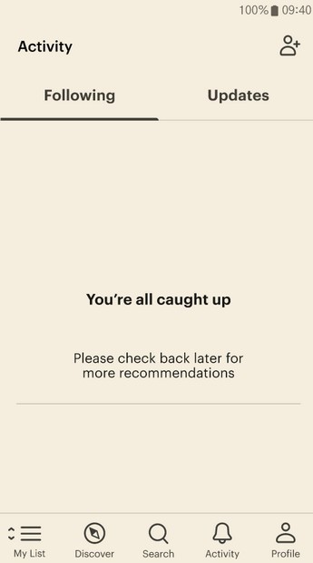
This is my first at an app-based project in Figma. I decided to replicate and redesign one of the apps I use most on my phone, Mozilla's Pocket. I'm an avid article reader, and with all of my train commuting in Berlin, I've been using it a ton. This is the 3rd version I arrived at, and you can play with the prototype at this link here. The biggest changes I made from the original are removing the bottom bar (and moving the button to get to the archive up top), and generally removing a lot of pieces of the app that I don't use and generally get in the way for me.
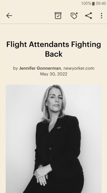
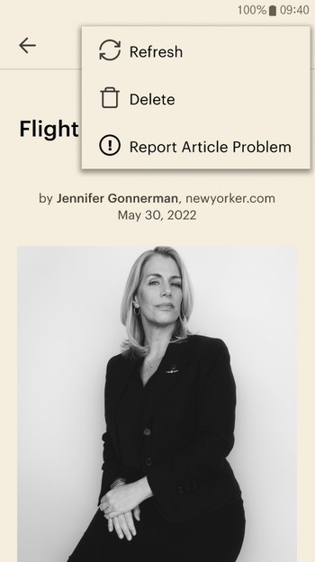
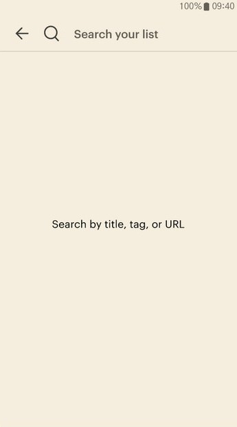
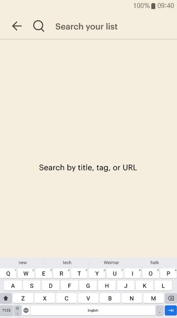
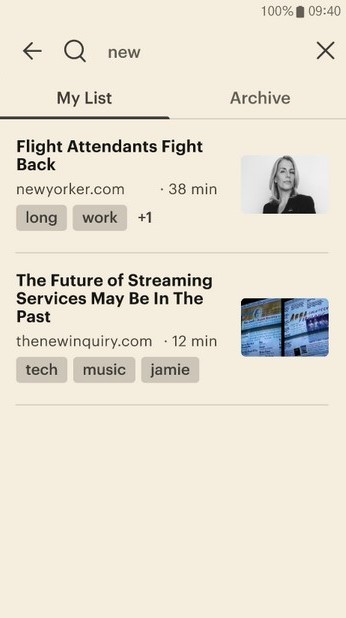
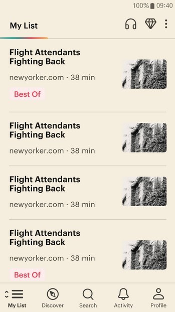
There are a lot of interwoven interactions, but here's what you can do (in the order of the above photos): -Switch between the List and the Archive at the top, -Open the first article, -Open the pop-up option menu and Refresh the page, Delete from your collection, or report a problem, -Open the Share pop-up and Copy the link to the clipboard, -Open the page for adding tags, -Move the article to the archive (and from there you can see it in the archive page and add it back to the list). Back on the main List page you can -Click the search button and try the 4 prompt options, -Open the pop-up menu, and refresh the page or open the Help webpage, and -Do a swipe action on the articles to open a different way to access Add Tag page, move the first article to the Archive, Delete it, and Share it!
Ultimately I'm really happy with where I got with this, and I learned a ton, mainly about how Figma works, but also what feels good and what doesn't when it comes to how the app reacts to your actions and how information should be organized/accssible. It's a bit confusing now using the actual app because I'm expecting (and wishing for) the changes I made here! I could see myself returning to this and trying to add in a few more features, like a Sort By option in the pop-up menu of the List and the Archive, a Settings page, and a Text to Speech interface. I'd also like to flesh out the tag implementation more and add a bunch of microinteractions to make the interactions feel more lively. And of course more copy!
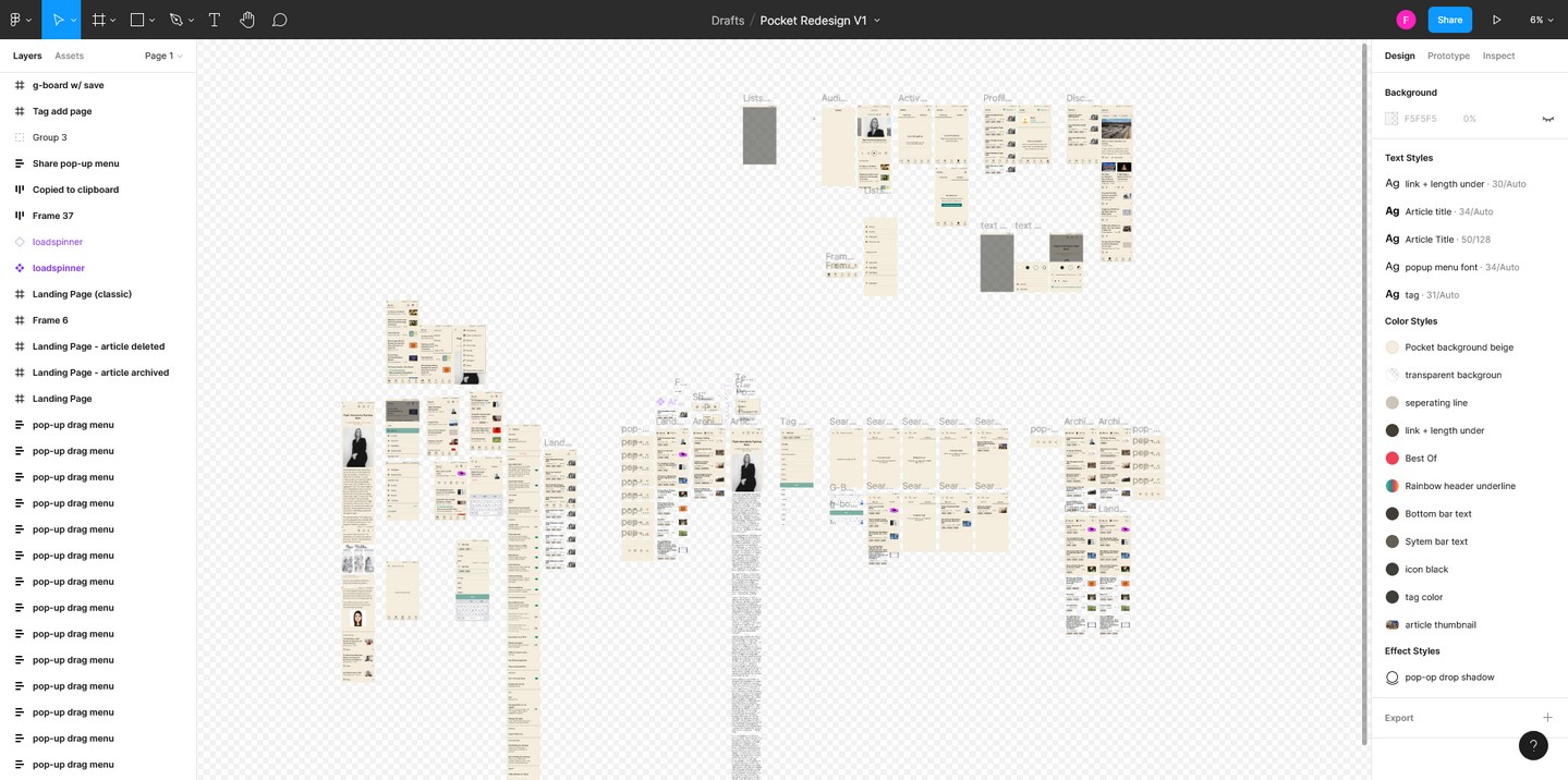
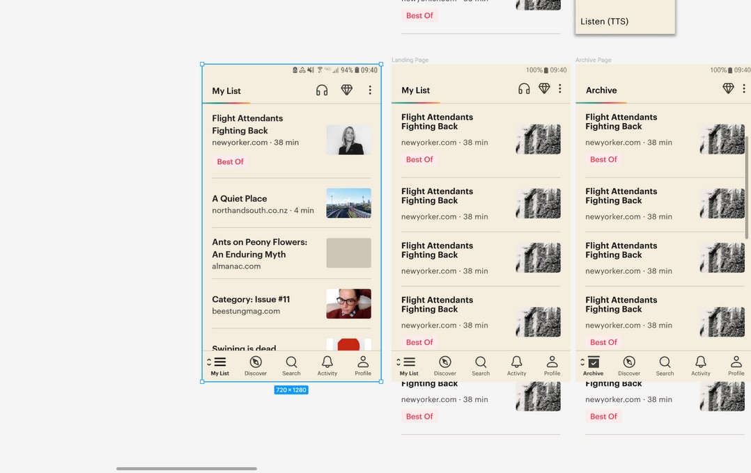
This was the middle iteration. The prototype isn't very different from the one above, other than being more polished, but as you can see from the first screenshot it was a much messier version of the project. This was a kind of sandbox mess-around stage of seeing what worked and what didn't. In the second screenshot you can also see some of the leftover attempts at the pages from the original app.

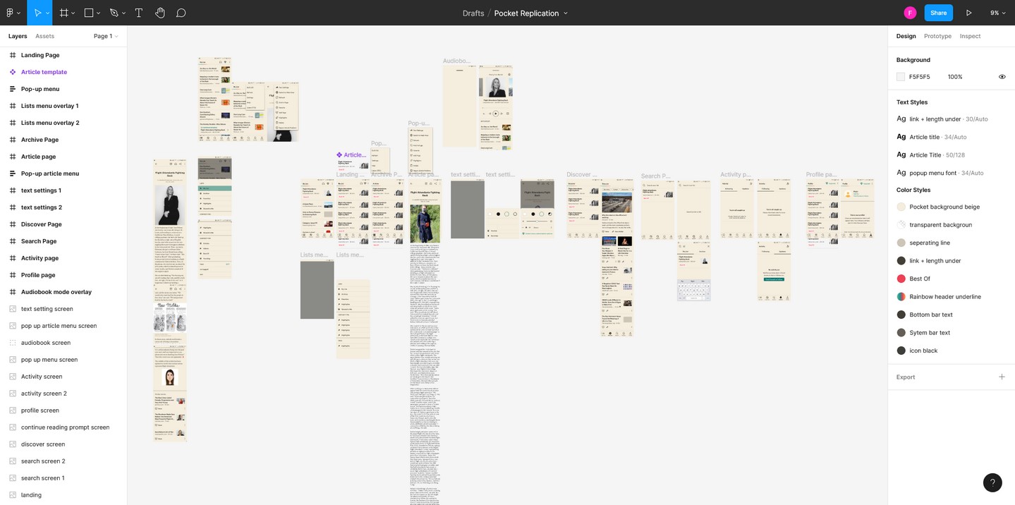
And this is the first replication attempt! I remade all of the components and pieces from scratch (you can see in the last photo the layout I had with screenshots next to the frame). I'm especially proud of figuring out how to make icons with the boolean operations so quickly. I got all of the basic functionality for navigation working, including the top and bottom bar and the buttons inside them. I left a lot of stuff incomplete because I only needed to get far enough to understand how to put the pages together, connect them, and figure out what I wanted to keep on the redesign.