
September 2020 - present
My dynamic online portfolio and digital home/hermitage.
This is a website built from scratch in HTML & CSS and is hosted on neocities. The first complete version was finished in a month, and I continue to regularly maintain it, fixing things as I go, adding and changing pages as needed.
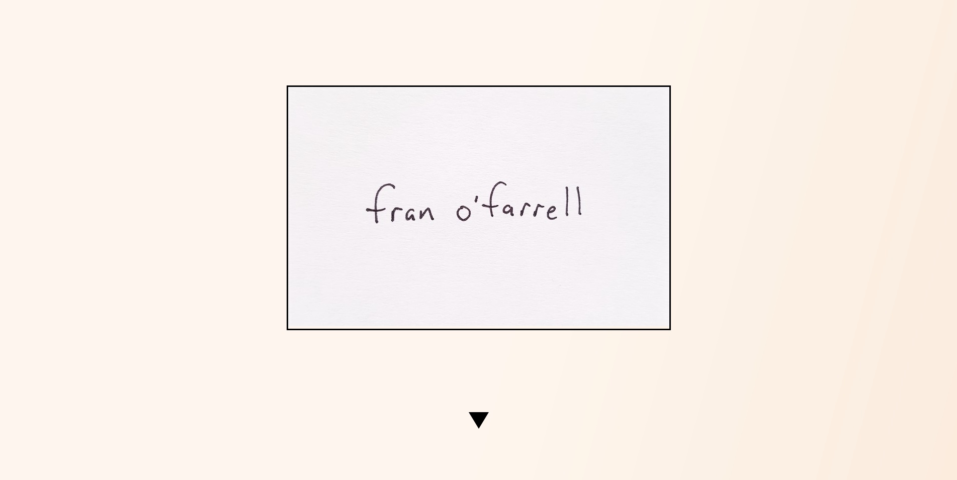
So, focusing on design: the entry point into making the website was, of course, the home page. Early on I had a clear idea that I wanted a clean, uncluttered landing page, and I wanted the main navigational links not immediately visible, but on the same page. I arrived at this main card with my handwritten name (to convey the home-made intimacy of the site), then an arrow to indicate the need to scroll, then these three categories of exploration: Resume, Info & Contact, and the Directory, that each serve as different portals into the content of the site. I also knew I didn't want a flat white background because it's too harsh on the eyes. I decided to go with an comforting, earthy beige gradient.
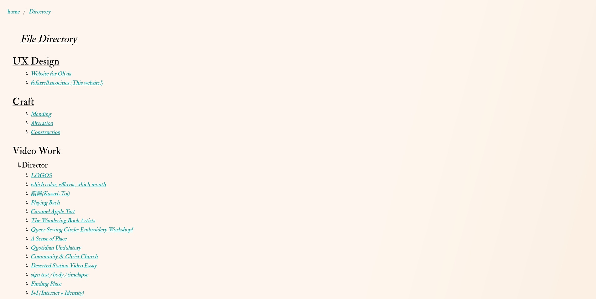
Working backwards, I'll start with the Directory, since it is in a way the organizing concept of the site. I've always loved a website with a sitemap, and I wanted to have this sense of transparency that someone browsing the site had access to everything they might want to find and wouldn't have to dig around through some confusing chain of links. The directory is a way of saying, “Here it all is, have a look at whatever you like. You can always come back here if you get lost." The idea of file organization also motivates having nested categories, as well as the breadcrumb header at the top of each content page.
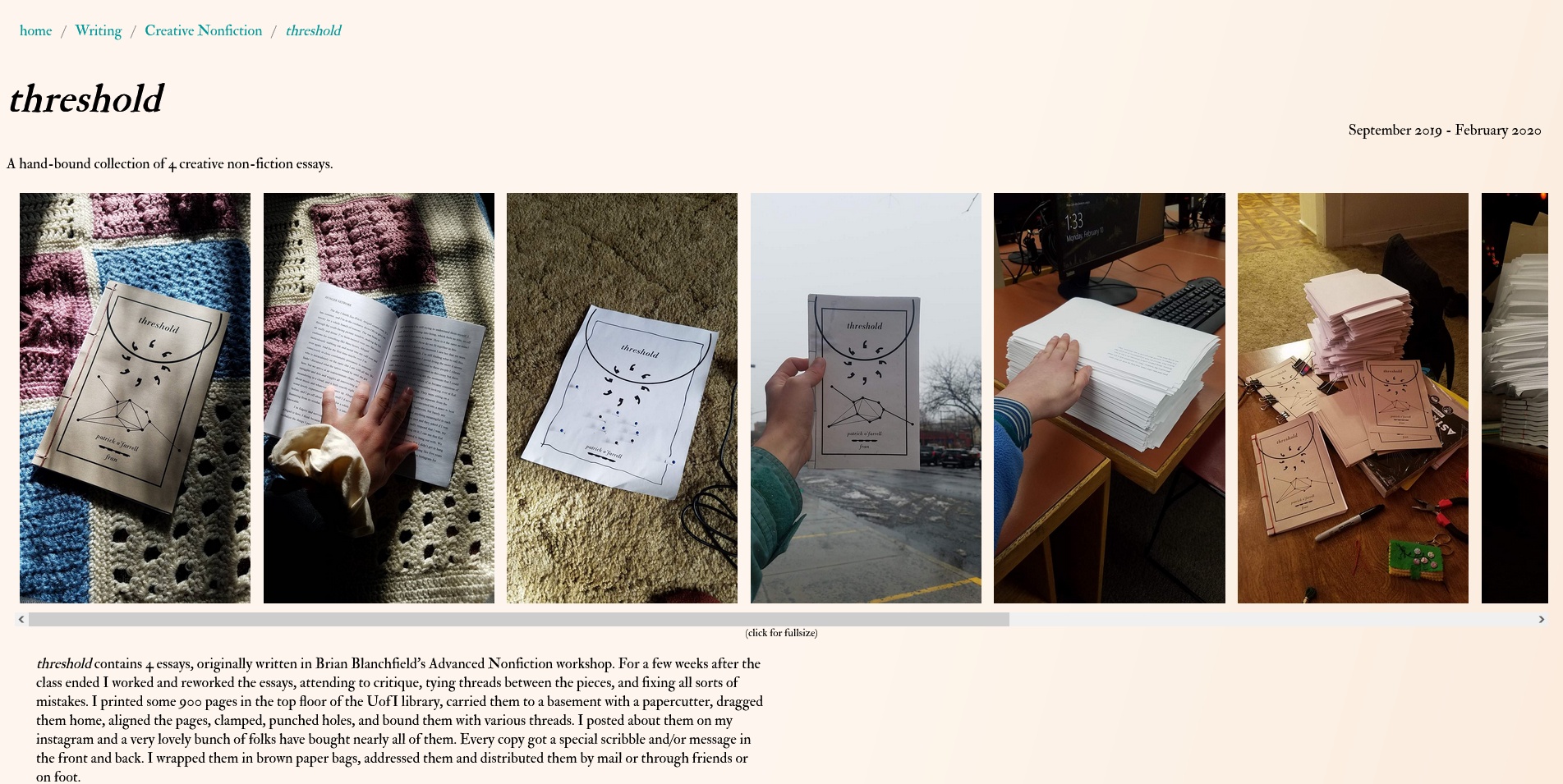
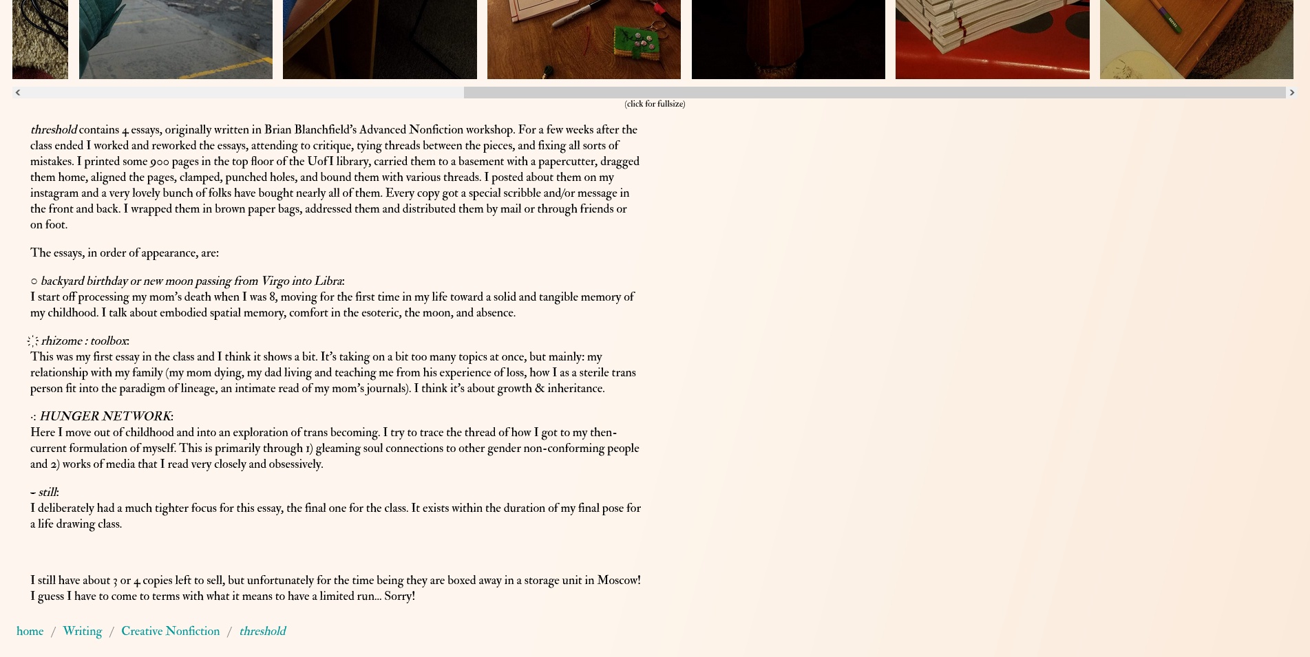
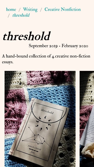
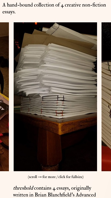
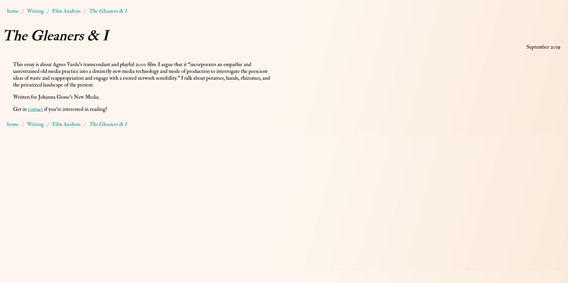
Moving into the content pages, let's look at the page for threshold. If I'm remembering correctly, this was the first page I started making, and it serves as a kind of template for every other content page on the site. Going through the component parts; at the top is the breadcrumb header, and each of the links takes you to either the section of the directory it refers to, or the homepage. Next is the title: big, bold, and beautiful. Then the date and the “blurb". Since it is primarily a portfolio site, it felt important to have a temporal stamp as well as a brief description so someone could appraise whether this was what they were looking for before reading the whole thing. In the case where the main description is short enough, there is no blurb.
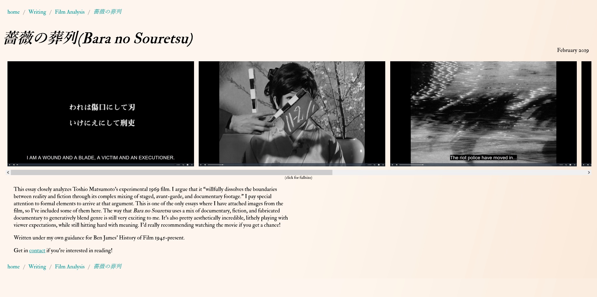
The next big component is the image scroll. It's the first thing that significantly changes on mobile. In that mode the right margin vanishes to imply there are more images to see off to the right. There is almost always the prompt underneath the scroll box that images can be clicked to see a higher resolution, and on mobile there is also a prompt to scroll. All of the mobile design for the site relies on conditional CSS rules about view window width. This is a simple fix that allows it to apply immediately and elegantly to any screen regardless of device, whether it's a phone, tablet, or just narrow desktop window.
That just leaves the body text and the same breadcrumb of links at the bottom. The body text expands to fill the width of the page up to 888 pixels where it holds the left-aligned paragraph form to retain readability and prevent it from spooling across too much space.
There are a few derivations of this main content page design, let's have a look.
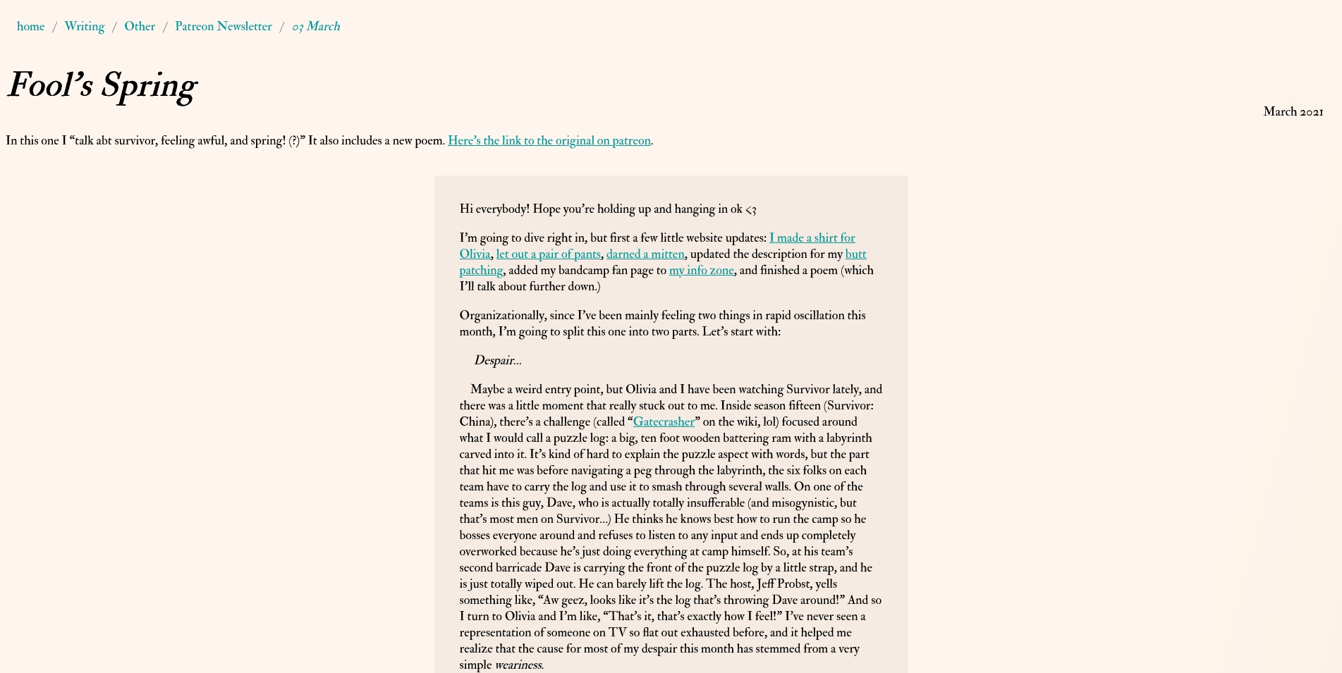
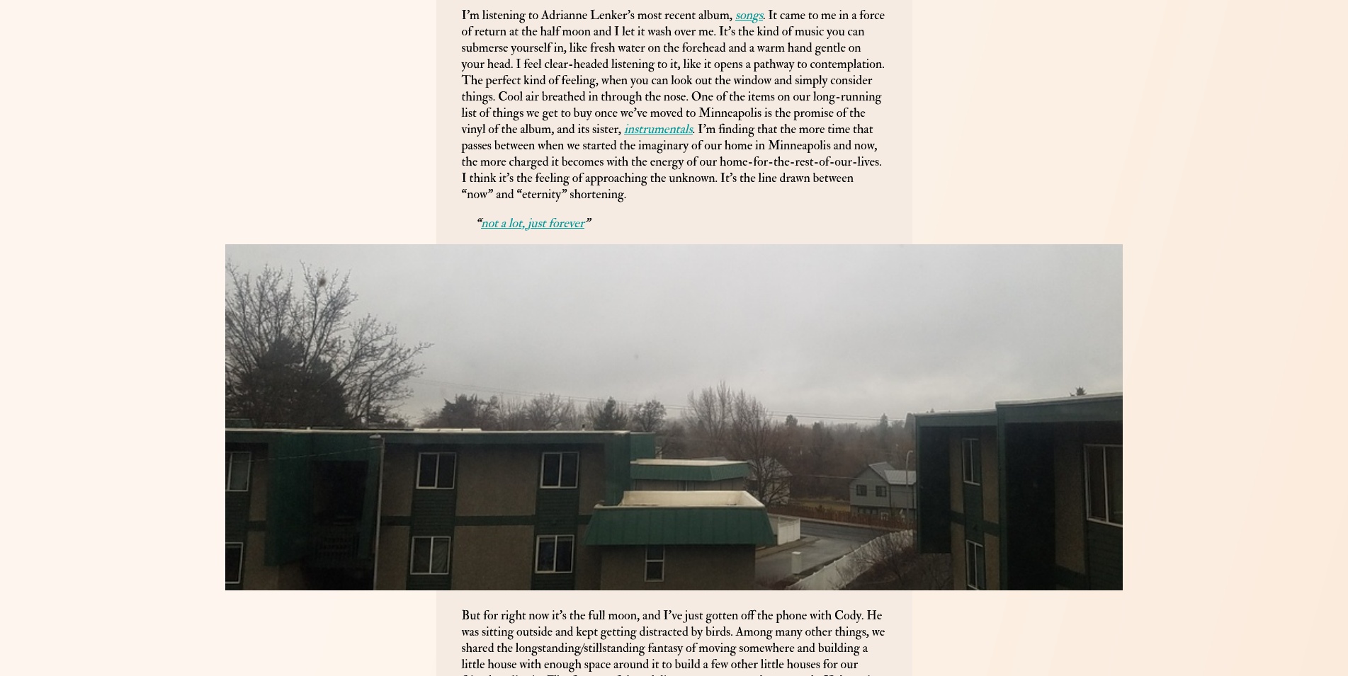
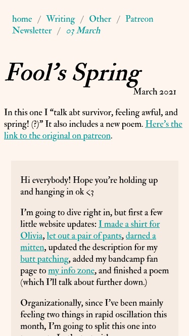

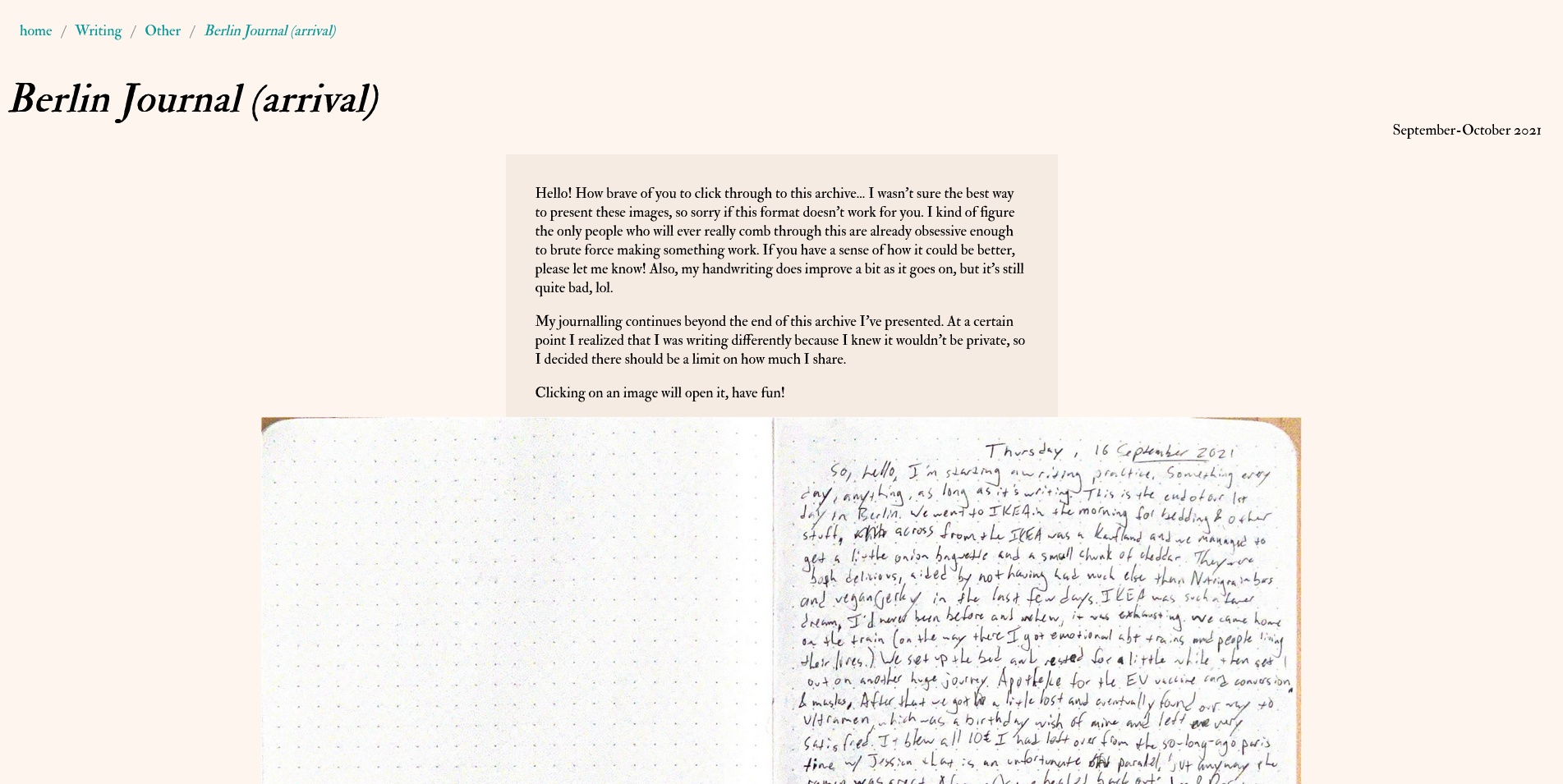
The biggest change came in November 2021 when I moved the newsletters I'd done on Patreon for the first two thirds of the year into the archive of my website. I didn't have a design to handle so much text, so I arrived at this frame/column with a slightly darker background color that limits the width to 600 pixels to hold the paragraphs in a good, readable size. I'm also very pleased with how I made the wide-format images exceed the edge of the frame, I think it looks really nice. On mobile they press to the edges of the screen
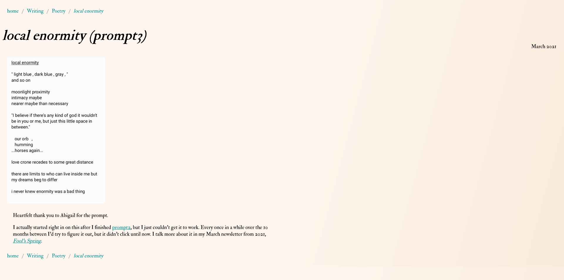
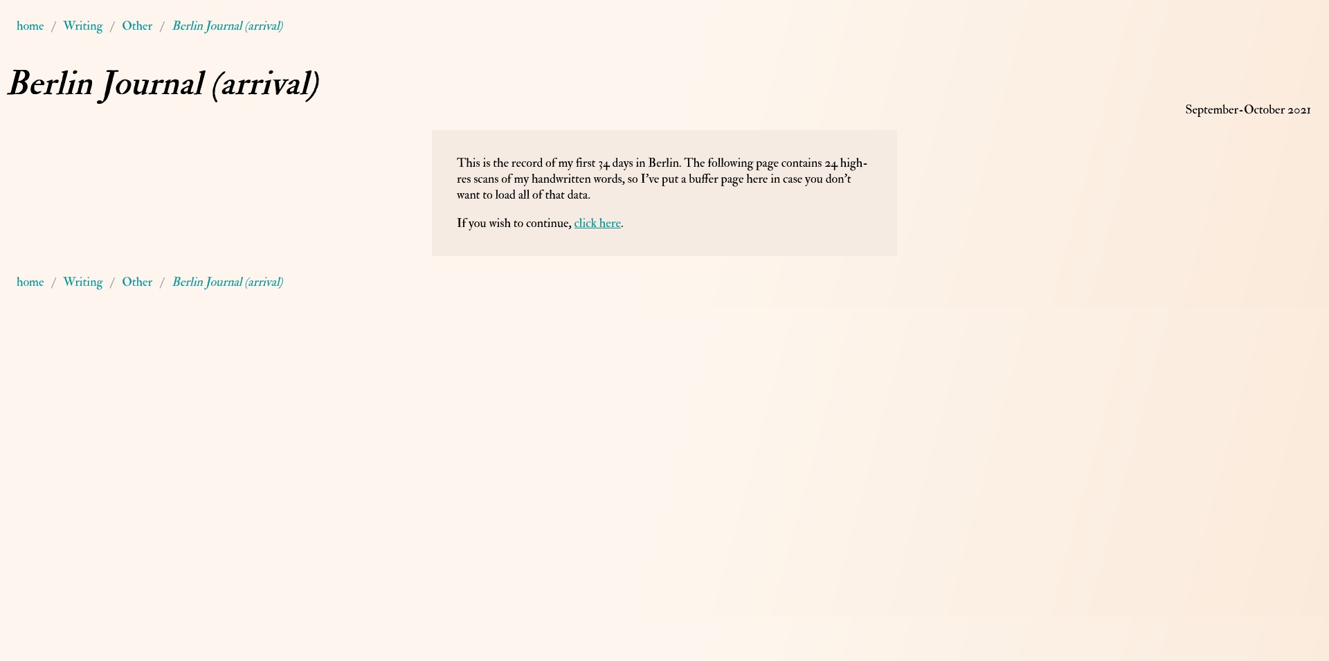
In order, you can see that on video pages the first slot in the image scroll is filled with an embeded youtube or vimeo video. For the Film Analysis pages there isn't a blurb, and this is the case on other pages that aren't long enough to need them. The poetry pages are as pared down as possible, with just an image of the poem and any descriptive info that's needed. Last is the page for the first of month of my Berlin journals, which is a derivation of the patreon newsletter format. First is a buffer page that lets people know the next page is going to load a lot of images, then you can click through to the main content page.
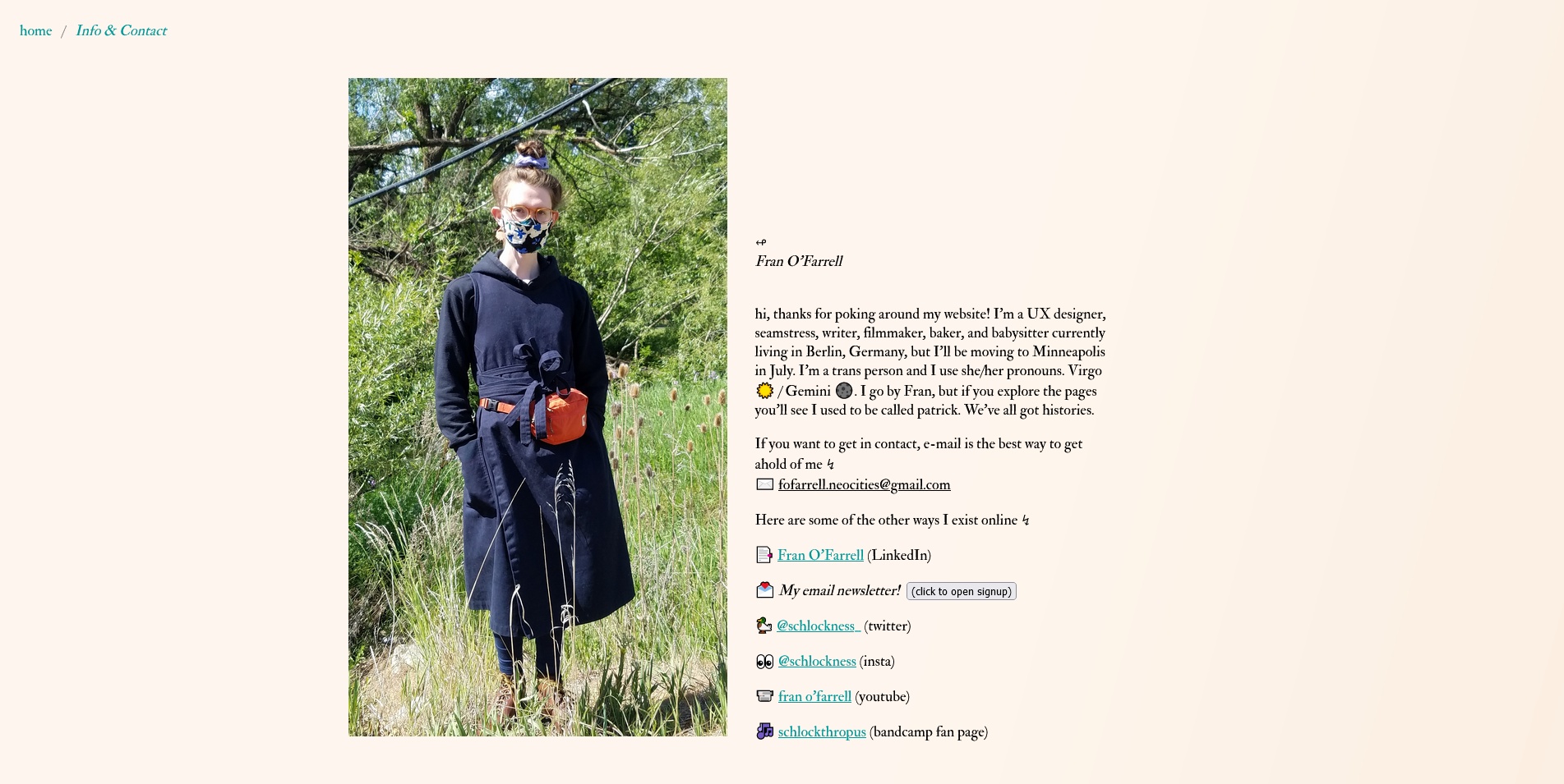
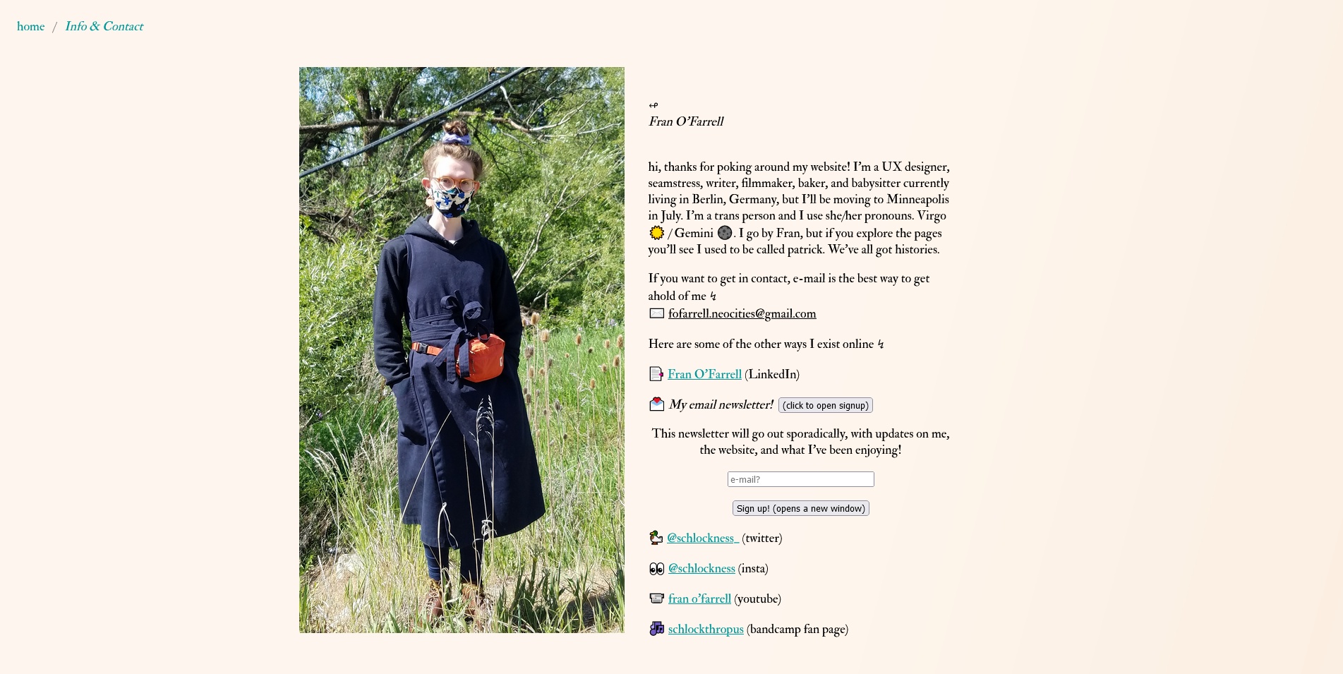
Returning to the main page's links, here is the Info & Contact page. It has three sections. The first is the bio, with an email and links to other places I can be found online. There is also a button to open the field for signing up to my newsletter. I tried quite a few different options for how to handle the newsletter signup, but I am happy with where I arrived, since it fits nicely in the format of the other links and is a fairly smooth and easy process for people signing up, not requiring a lot of extra steps that pull you away from the page.
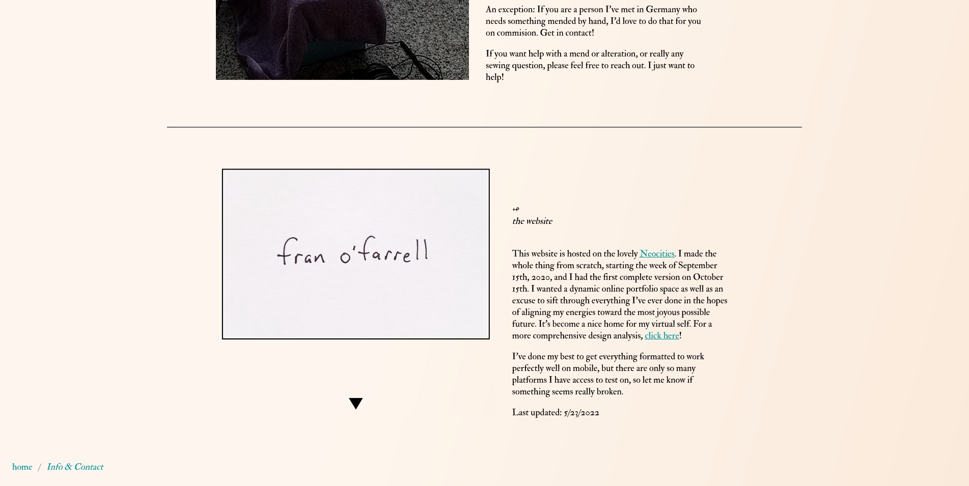
The second section is for the alteration and mending practice that I was doing on comission when I was living in Idaho. I intend to start it up again in Minneapolis once I have to the time and a space set up for it. The last section is some brief info about the site, which is now expanded here on this page! There is also a date for when I last updated the website. This fits with my goals around transparency. So often I find a cool website, but I have no idea when anything on it was made or how long it's been since it was updated. It's important to me that websites aren't left to stagnate or fall apart. I want this place to feel alive!
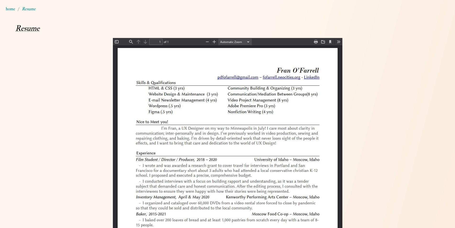
Finally, the Resume page. A bit anticlimactic, but absolutely necessary! I decided I wanted it as an embeded pdf. If the pdf embed isn't supported (which isn't uncommon), there is instead a download link, which seems to be the norm. Originally, this housed a CV instead of a Resume, so it was more of a highlight list of projects I was proud of that demonstrated skills. The titles of projects on the pdf linked to pages on the website, so it was a different way of accessing things you would otherwise find through the directory. I intend to re-incorporate a kind of “highlights" page somehow, but for the time being while I am actively looking for a job, the resume makes more sense here.
And that's all! Check back later, as I'm always updating and augmenting things. Thanks for looking!